Weekend · July 29, 2026
The sea's two calm states
the stil editorial team · 3 min read
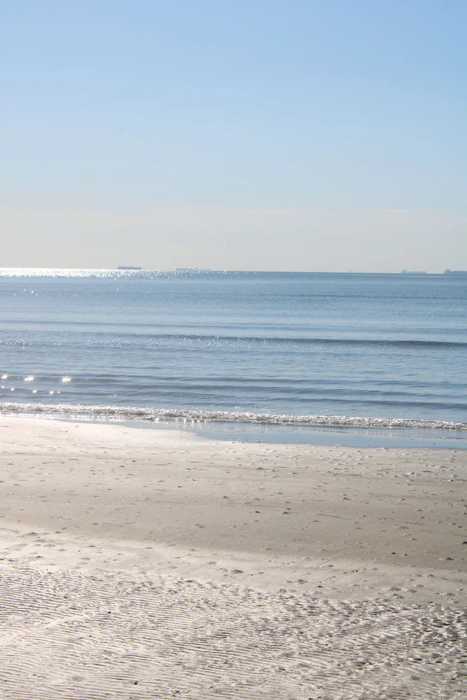
The word calm doesn't point to a single color. These two shoreline photographs tell the same word through two different palettes: a blue that shines with light, and a gray that sits quietly under cloud.
When choosing colors to wear, we often mistake calm for dull. These two photographs show the difference. Calm isn't a lack of energy; it's a balance built on low contrast.
There is a third frame, and in it a woman stands at the edge of the water. The palette barely moves; the question does. What does a person wear inside a blue like this?
The blue inside the light
The water along this shore is nearly still, but light keeps breaking across its surface, throwing off thousands of tiny glints. The wet sand reflects the same sky a second time. What results is a blue that feels alive without ever feeling loud. Looking for this tone in a summer outfit means understanding the difference between a bright blue and a blue that shouts. The first one carries light; the second one drowns it out.
The gray beneath the cloud
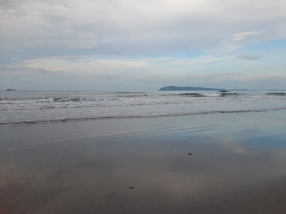
The same sea, on a different day, offers a different kind of calm. There's no glitter here, but there's no unease either. The gray sky pulls the water into its own tone, and the waves break with foam at a slow, even pace. A gray like this gets underrated as a base color for an outfit, when it's actually one of the hardest-working tones around. Whatever color joins it, whether earth, rust, or deep green, draws its strength from this gray's quietness.
A calm that was built, a calm that simply happens
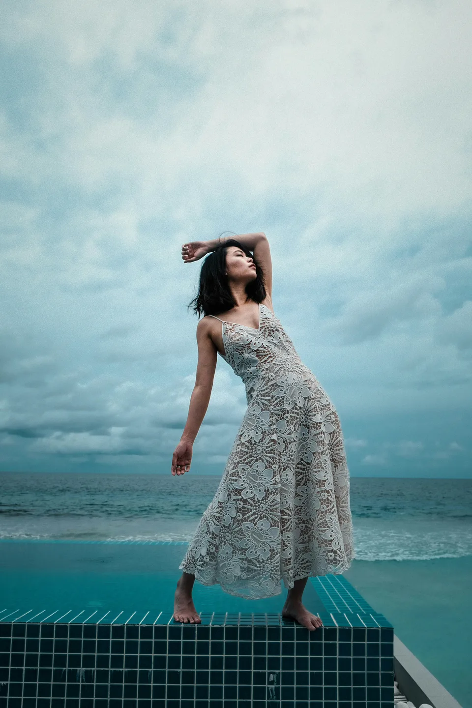
Three separate bodies of water share this frame. The nearest one, the pool, is holding still: its surface barely moves, and the mosaic grid on its floor reads all the way through. Where the pool ends, a thin and very exact line begins. Beyond that line the open sea is foaming, edgeless, never the same for two seconds together.
An infinity pool exists to erase that line, to hand its water over to the sea. This one doesn't quite manage it. The pool's own turquoise stays visible, and so does the mosaic rim. It could be read as a failure, but it is what holds the photograph up: a calm that was constructed and a calm that arrived on its own, in the same frame, with a border a finger wide between them.
Look at the light. The sky is overcast from edge to edge and there is no hard shadow anywhere. Which means this frame belongs to the gray of the second section, not the bright blue of the first. The same calm, except that this time it has a garment standing in it.
Not wearing the color of the water
The dress is cream, a guipure lace worked with large flower motifs, and it is the only thing in the frame without a color. The sea's gray, the pool's turquoise, the cloud's lead: all of them are relatives of blue. The dress sits outside that family, and that is precisely what keeps the two waters distinguishable. Take the neutral field out of the middle and the turquoise and the gray blue would collapse into one murky blue.
Up close, the dress turns out to be perforated from top to hem. The gaps between the motifs let light through the cloth. On a closed day a plain cream dress would look flat, because there is no shadow available to shape it. Guipure manufactures that shadow inside the fabric itself: every hole carries its own small darkness.
One more detail, and it is the quietest beauty in the picture. The pool's mosaic, with its white grout, lays down a regular grid; the dress's lace is a grid as well. Everything else here has no edge at all: the cloud, the swell, the foam. Two ordered textures find each other in the middle of an edgeless landscape. The practical version of that: when dressing within a calm palette, the piece carrying the outfit is usually the colorless one, and it earns its place through texture rather than color.
- sea
- color
- summer
Photo: Windy Craig / Pexels · Kiddbubble / Pexels · Minh Pham / Unsplash